The visulizations created from the data sources offer insights on the relationship between schools in Chicago and demographics of the area the school is located in, focusing mainly on how the poverty of the area affects schools.
This interactive visualization shows where public schools in Chicago are located. The name of each school can be found by clicking on the location icon. The map shows that the vast majority of public schools in Chicago are elementary schools, with the next most being high schools. There are very few public middle schools in comparision. Based on the map, it appears that there is a somewhat even distribution of schools among the Chicago; however, there is a clear lack of schools near Millenium Park and the Loop. Zooming in further to the map, this area is home to the Chicago campus of Northwestern and the University of Illinois at Chicago. This area of the city thus likely has a younger demographic and is a popular tourist spot, which is why there are fewer elementary/middle/high schools.
This interactive visualization breaks the map of Chicago into police wards and shows the poverty level of each ward (represented by the color). The dark gray color represents missing data from that particular ward. The blue circles represent the number of schools and the average location of the schools in the ward, with larger circles signifying more schools. It appears that there are larger circles in wards with darker colors, suggesting that there are more schools in the poorer wards. This makes sense because the data only contains public schools, meaning that there are potentially more private schools in the wealthier wards. While the previous map showing the location of each school in Chicago appeared to illustrate a somewhat even spread among the city, this map shows that there is a difference between each ward. Another insight that can be drawn from this map is that the north side of Chicago appears to have overall lower rates of poverty than the central and south sides.
Based on the survey administered to students and teachers, schools were rated and assigned scores based on a varity of characteristics, including safety, environment and performance.
The scatter plot illustrates two of these survey results, plotting the Environemnt Score of each school against the school's Safety Score. The graph illustrates a moderate positive corrlation between the two dimensions. This suggests that while there are likely many other factors that go into the overall perceived environment of a school, the the perceived safety of the school plays a role.
Combining the poverty data with the results of the school surveys, the bar chart shows how the average safety score of the schools within each zip code tend to vary with the poverty rate of the zip code. There appears to be a negetive trend in the relationship between safety score and poverty rate, meaning that zip codes with an average lower safety score tend to be in areas with a higher poverty rate. This illustrates how the demographics of the surrounding area factor into how schools in that area are perceived.
Again studying poverty rates, this visualization plots the poverty rates for schools with the same CPS Performance Policy Status, with Level 1 indicating the highest performing schools, and Level 3 indicating the lowest. The line in the middle of each box plot represents the median poverty rate of schools for each Level. The graph shows that Level 1 schools on average have the lowest poverty rates, followed by Level 2 schools, with Level 3 schools having the highest poverty rates. Once again, this shows how schools are influenced by the demographics of their surrounding areas. This could also suggest that schools in areas with higher poverty rates have less funding, attributing to their lower performance level rating.
Along with the poverty levels of zip codes, the data on demographics includes the racial composition of each zip code in Chicago.


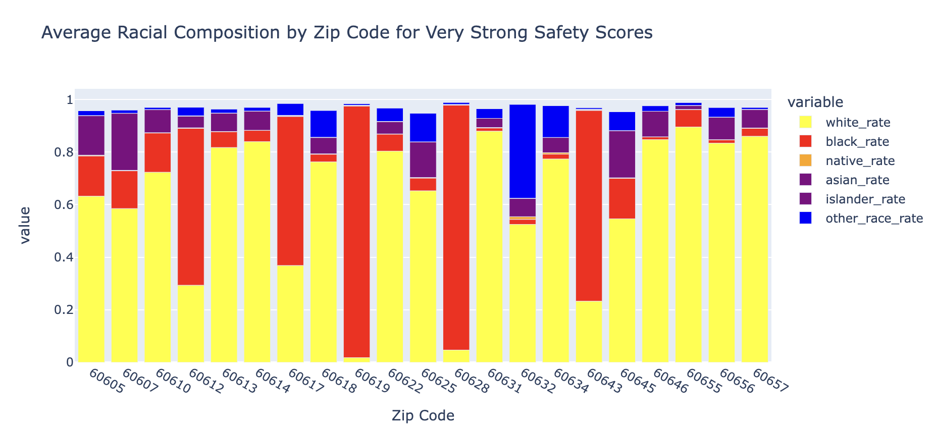
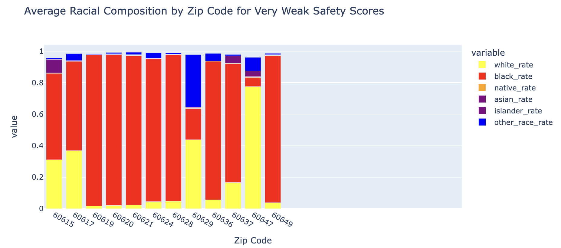
These plots display the average racial composition of each of zip code, broken down by the safety icon of the schools in that zipcode. Safety icons are a rating that come from the safety scores of the student perception survery, with a safety score 80 or above associated with a "Very Strong" Safety Icon, and a safety score below 20 associated with a "Very Weak" Safety Icon. Comparing the zip codes with schools that have a "Very Strong" and "Very Weak" Safety Icon scorings, we can see that there is a vast difference in the average racial composition. For zip codes with schools rated "Very Strong", the majority have a primarily white make-up, with 16 out of 21 of the zip codes have a white majority. However, for the zip codes with a "Very Weak" Safety Icon rating, only 2 out of 12 zip codes having a white majority. For this rating, the other 10 zip codes all have a black majority, with 7 being over 90% black. This shows that schools in primarily black neighborhoods appear to have a lower safety rating. This could suggest that these areas are seen as less safe potentially due to stereotypes of having gang associations or "slums".

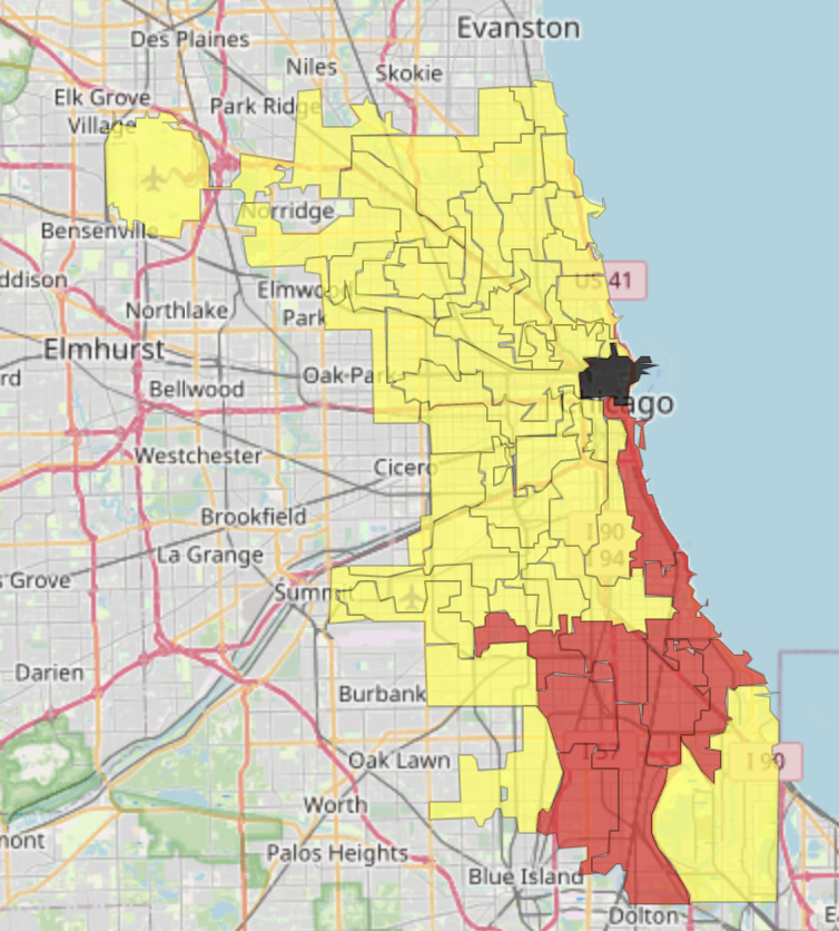
To find out where these zip codes are located, this map combines the zip codes into wards and displays the majority race in each ward. The map shows that wards have either a white majority (yellow) or a black majority (red). Looking at the map,it is apparent that these majority black disctricts are located soley on the South Side of Chicago. Therefore, the lower safety ratings are likely due to the areas that these schools are in, as the South Side is typically viewed as more dangerous and has higher levels of crime.